
Importance of Web Design
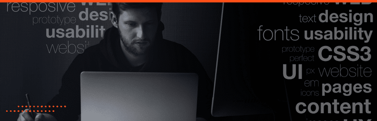
In today’s digital era, a compelling and user-friendly design is critical for any business. It serves as the virtual face of your company, offering potential clients and customers a glimpse into who you are and what you provide.
A well-designed website attracts and retains visitors, increasing engagement and leading to higher conversion rates.
Furthermore, by integrating SEO principles in design, a website can enhance its visibility in search engine results, thereby gaining more organic traffic.
Therefore, investing in thoughtful and effective design is an aesthetic choice and a strategic business decision.
The Consequences of Bad Website Design

Conversely, poor web design can have detrimental impacts on your business. An unappealing or confusing website can drive away potential customers, creating a negative first impression that’s hard to shake.
User Frustration
Websites that are difficult to navigate can result in user frustration, diminishing customer satisfaction and trust.
Audience Alienation
Websites not optimized for mobile devices may alienate a significant portion of your audience, as more people are accessing the web via smartphones and tablets.
Lack of Seach Engine Visibility
Additionally, if SEO principles are not integrated into the design process, your website might rank lower in search engine results, decreasing visibility and potentially losing business opportunities.
Ultimately, bad website design affects the user experience and can directly impact your company’s bottom line.
What Makes a Website “Bad”?

A “bad” website typically suffers from design and functionality flaws, causing poor user experience.
One of the most glaring issues is poor navigation. When users can’t find what they need quickly and easily, frustration mounts, leading to high bounce rates and diminished engagement; another common problem is slow loading times, which can make even the most patient users abandon your site.
Websites not optimized for mobile viewing also fall into the “bad” category as they fail to cater to a rapidly growing segment of users who browse the web via their mobile devices.
An outdated or unattractive design can give the impression of a lackluster or amateur company, leading potential customers to question the quality of your products or services.
Finally, the absence of SEO practices in a website’s design can render it virtually invisible in the crowded digital landscape, dramatically affecting its reach and effectiveness.
First Impressions: Why Design Matters in Retaining Visitors

In the hyperconnected digital world, first impressions are often formed within seconds, and the design of your website plays an instrumental role in shaping these perceptions.
A visually appealing, user-friendly, intuitive website design captures and retains visitors’ attention. Good design tells a story and conveys the brand’s message effectively, inviting visitors to engage with the content and explore further.
Moreover, a well-designed website exudes professionalism and credibility, fostering trust and confidence among the audience. Factors such as color scheme, typography, layout, and visual hierarchy contribute significantly to the overall user experience and satisfaction.
Conversely, a poorly designed website can deter visitors at first glance and increase the likelihood of them navigating away, regardless of the quality of the products or services being offered.
Therefore, investing in high-quality website design is about aesthetics and creating lasting positive impressions that engage and retain visitors.
Understanding the Scope: Beyond Aesthetics

Web design is not just about aesthetics; it extends beyond the visual design aspect. It involves the complete user experience, which includes ease of navigation, load times, site structure, and accessibility, among other factors.
Even the most visually stunning website can fall flat if users find it challenging to navigate or have slow loading times.
A significant part of the design is about understanding the user journey and making this journey as seamless and engaging as possible. A well-designed website intuitively guides users from one section to another, providing them with the information they need clearly and concisely.
It’s about creating an engaging narrative that keeps visitors on your site and encourages them to take action, whether purchasing, signing up for a newsletter, or contacting your team for more information.
When we talk about good web design, we’re talking about aesthetics, functionality, and user-centric design.
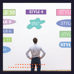
Common Indicators of Bad Website Design

Identifying the signs of bad website design can help prevent many issues that deter visitors and undermine your online presence. Here are some key indicators to look out for in bad website examples:
Overcrowded Layouts

An overcrowded layout is a common indicator of bad website design. A site crammed with images, text, and other elements can appear chaotic and confusing, hindering users’ ability to find the necessary information.
The lack of white space (the space between different elements on a page) can make the content difficult to digest and the site visually unappealing.
Good website design understands the importance of balance and space. It strategically uses white space to break up content, making it easier for users to focus and absorb information.
Therefore, a well-structured, clutter-free layout is aesthetically pleasing and enhances the site’s usability and effectiveness.
Inconsistent Fonts and Colors

Inconsistent use of fonts and colors is another telltale sign of bad website design.
Using multiple font styles and sizes can make your site appear disorganized and unprofessional, making it difficult for users to read and process information.
Similarly, a haphazard color scheme can detract from the overall aesthetic appeal of your site, compromising its effectiveness in capturing and retaining visitor attention.
In contrast, good design maintains a consistent typographic and color palette throughout the site. Consistency in fonts and colors contributes to the visual coherence of the site, creating a more pleasant and user-friendly experience. It also helps reinforce your brand identity, making your website more memorable and recognizable to visitors.
Carefully selecting and consistently using fonts and colors are crucial to effective website design.
Lack of Mobile Responsiveness

A lack of mobile responsive design is another red flag, signaling poor web design. With many internet users accessing the web through mobile devices, a website not optimized for mobile viewing can severely impact user experience, leading to visitor loss.
Mobile users expect the same functionality and ease of navigation on their devices as they would on a desktop. Users will likely abandon the mobile site if text, images, or site elements are distorted, too small, or unviewable on a mobile device.
Good web design incorporates mobile responsive design as a key feature, ensuring that the website adjusts to fit different devices and screen sizes and offers a seamless experience across various devices.
Mobile responsiveness is not just an added feature in modern design – it’s an absolute necessity.
Slow Loading Times

Slow loading times are indeed a major impediment to a good user experience.
In today’s fast-paced digital age, users expect websites to load quickly and efficiently. Any delay in loading can result in user frustration and may lead to visitors abandoning your site, adversely impacting your bounce rate.
Research suggests a delay of even a few seconds in page response can significantly reduce visitor engagement. Furthermore, slow loading times can harm your site’s search engine ranking, as site speed is one factor that Google considers in its algorithm.
Good web design prioritizes speed and efficiency, optimizing images, enabling browser caching, and reducing server response time to ensure quick loading.
Addressing slow loading times is about improving user experience and boosting your website’s visibility and ranking on search engines.
Invasive Pop-Ups

Invasive pop-ups are another indicative sign of bad website design. These intrusive interstitials disrupt the user’s browsing experience, often causing annoyance and frustration.
They tend to pop up unexpectedly, obscuring the main content and forcing users to close them before they can proceed.
While pop-ups can be used effectively for certain functions, such as newsletter signups or important announcements, they should never be implemented to hinder user navigation.
Good design incorporates pop-ups judiciously and user-friendly, ensuring they do not interfere with the user’s journey on the site.
Avoiding invasive pop-ups is crucial for maintaining a positive and seamless user experience.
Unclear Navigation

Unclear navigation is yet another common symptom of inferior website design. When users visit your site, they expect a seamless and intuitive navigation experience that allows them to locate the information they seek easily.
Navigation menus should be visible and logically organized. If your website has complex structures, confusing labels, or hidden navigation menus, it can disorient users, causing them to feel frustrated and leave.
In contrast, effective design prioritizes clear and simple navigation. It uses appropriate headers, footers, and breadcrumbs and ensures every page is accessible within a few clicks.
Clear navigation is essential for providing a satisfying user experience, retaining visitors, and encouraging them to explore your website further.
Outdated Design

An outdated design is a clear sign of inferior website design at a time when internet trends and technologies are continuously evolving.
A website landing page that looks like it hasn’t been updated in years can quickly lose credibility in visitors’ eyes.
Modern users expect clean, up-to-date, engaging designs that reflect the digital landscape. Elements such as outdated fonts, passé color schemes, cluttered layout layouts, and lack of multimedia content can all give the impression of a dated website.
On the other hand, effective web design stays abreast of design trends, incorporating contemporary aesthetics and innovative features to provide a fresh and compelling user experience.
Updating your website’s design is essential in maintaining user interest, enhancing credibility, and staying competitive digitally.
Misguided Design Elements: The Culprits Behind Bad Websites

Misuse of Multimedia: Videos and Audios That Auto-Play

A common pitfall of poor website design is the misuse of multimedia, particularly videos and audio that auto-play.
Auto-playing media can be disruptive and intrusive, often startling users and forcing content upon them without their consent. This approach is particularly problematic if the user is in a shared or quiet space and suddenly loud audio begins to play.
Auto-playing videos can slow webpage load times, negatively impacting user experience. Furthermore, it can consume unnecessary data for those browsing on mobile or under limited data plans.
Good web design practices advocate for user control, allowing users to decide when and if they want to play a video or audio file. Therefore, avoiding the misuse of auto-playing multimedia is crucial to maintaining a respectful and user-centric website design.
Cluttered Sidebars and Unnecessary Widgets

Cluttered sidebars and unnecessary widgets are additional culprits contributing to bad website design.
Overloading the sidebar with too many links, ads, or widgets detracts from the main content. It overwhelms visitors, making it difficult for them to focus on the essential elements of your site. These distractions can significantly hamper the user experience, leading to higher bounce rates.
Unnecessary widgets, such as stock tickers or weather updates unrelated to your website’s content or purpose, can confuse visitors about your site’s objective.
Effective design emphasizes simplicity and relevance, using sidebars sparingly and only for essential, contextually relevant features. Hence, avoiding cluttered sidebars and unnecessary widgets is vital to providing a clean, focused, and user-friendly website design.
Overuse of Stock Photos and Irrelevant Imagery

Overuse of stock photos and irrelevant imagery can significantly detract from the authenticity and impact of a website.
While stock images can be a convenient resource for website owners, their excessive utilization may lead to a generic, impersonal feel that fails to resonate with visitors. Visitors can often distinguish stock photos from original images, which may doubt a website’s credibility.
Similarly, irrelevant imagery that doesn’t align with your content or brand message can confuse visitors and distract them from your core message.
Good design incorporates visual elements thoughtfully, prioritizing original, high-quality images that accurately represent the brand and enhance the content’s relevance and understanding.
Therefore, avoiding overusing stock photos and irrelevant imagery is crucial to maintaining a credible and effective website.
Hidden Navigation Menus and Non-Intuitive Site Structures

Hidden navigation menus and non-intuitive site structures indicate poor website design.
Users appreciate straightforward, easily navigable websites. If they struggle to locate your navigation menu or find it difficult to comprehend your site’s layout, their user experience is negatively affected.
Hidden or poor navigation can lead to frustration, confusion, and site abandonment.
On the other hand, a well-designed website will have a clear, visible navigation menu and an intuitive site structure where information is logically grouped and conveniently accessible.
The Three-Click Rule
The ‘three-click rule’ principle – where users can find any information within three clicks – is often adopted for optimal user experience. Therefore, avoiding hidden navigation menus and non-intuitive site structures is key to ensuring user satisfaction and enhancing website usability.
The Traits of a Big Ugly Website

A “Big Ugly Website” represents an amalgamation of all the unsuccessful design elements and practices previously discussed, resulting in an unattractive, difficult-to-navigate, and ineffective website.
A confusing layout, hidden or complicated navigation menus, and non-intuitive site structures can typically characterize such bad websites.
The web pages are often filled with cluttered sidebars, loaded with unnecessary widgets that offer no value to the visitor and distract from the main content.
The design is likely outdated, featuring passé color schemes, outdated fonts, and a lack of modern, engaging features.
Overemphasis on ‘Flashy’ Without Substance

One common pitfall contributing to the making of a “Big Ugly Website” is an overemphasis on ‘flashy’ elements without substance.
Bad Websites are those that overload with animations, bright colors, and excessive multimedia but lack meaningful content often fall victim to this issue. While it’s true that visually striking elements can initially attract visitors without substantial and valuable content, these flashy elements quickly become a distraction rather than an enhancement.
Users visit websites seeking information or solutions, and if a website fails to deliver this due to an abundance of style over substance, the user experience is negatively impacted.
Balancing enticing aesthetics and substantial content is pivotal in quality design. Combining captivating design with valuable and relevant content should be the goal, avoiding the trap of empty flashiness that only serves to disengage visitors in the long run.
Bloated with Ads

Websites bloated with ads significantly degrade the user experience, leading to another aspect of ugly websites. When a webpage is overpopulated with intrusive advertisements, it distracts from the main content, making it difficult for users to focus on the information they seek. Especially obstructive are pop-up ads that cover the main page of content or auto-playing video ads that start unexpectedly.
Additionally, too many ads can slow down a website’s load time, leading to user frustration and potentially causing them to abandon the site.
Ads are a reality of the internet landscape, providing revenue for many websites. However, it’s essential to strike a balance. Effective web design involves unobtrusively integrating ads and respecting the user’s experience, allowing them to access the primary content seamlessly.
Avoiding a website design bloated with ads is crucial to maintaining user engagement and satisfaction.
The Pitfall of Trying to Be Too Innovative: When Unique Layouts Backfire

In the realm of web design, innovation, and uniqueness are often lauded. However, venturing too far from established norms can backfire, leading to a pitfall of trying to be excessively innovative.
When a website employs unique, non-traditional layouts in the name of originality, it may inadvertently confuse users accustomed to standard navigation practices.
Users have certain expectations when browsing based on common design conventions. If the website layout contradicts these expectations, the user experience can suffer, leading to confusion, frustration, and site abandonment.
The challenge for designers is to incorporate originality while maintaining familiar navigation and layout structures that users can intuitively understand.
It is about striking a balance between uniqueness and usability. Remember, in web design, the user experience is paramount, and pushing the boundaries of innovation should never come at the cost of user-friendliness and accessibility.
Non-Accessibility: Ignoring Diverse User Needs

In pursuing aesthetically pleasing designs or innovative features, web designers sometimes overlook accessibility, ignoring diverse users’ needs.
Accessibility in design refers to creating websites that everyone, including people with disabilities, can easily use and understand. This includes providing alternatives for visual content for visually impaired users, offering keyboard navigation for those unable to use a mouse, and ensuring websites are easily navigable for users with cognitive impairments.
A website lacking these features can create barriers for many users, resulting in a narrowed audience and potential loss of business. Therefore, considering accessibility from the initial stages of design is not just good practice; it’s necessary.
A site accessible to all, irrespective of their abilities, is truly a well-designed, user-friendly website.
Practical Steps to Avoid Bad Website Design

Avoiding bad design involves a mindful approach to user experience, aesthetics, and accessibility. Here are some practical steps:
- Simplify Navigation: Keep your site’s structure intuitive and straightforward. Users should be able to find the information they need within three clicks.
- Quality over Flash: Prioritize meaningful content over flashy elements. While aesthetically pleasing designs are important, they should never overshadow or distract from the site’s content.
- Balance Advertisements: Integrate ads in a manner that won’t detract from the user experience. The placement of advertisements should be strategic and non-obtrusive.
- Inclusive Design: Ensure your site is accessible to all users, regardless of their abilities. This includes providing alternatives for visual content, offering keyboard navigation, and ensuring the site is easily navigable for users with cognitive impairments.
- Stick to Conventions (When Necessary): While innovation is admirable, don’t stray too far from established website layouts. Navigational norms exist for a reason—they work.
- Fast Load Times: Optimize your site to load quickly. Users have little patience for slow-loading websites and will likely abandon a site if it takes too long.
By implementing these practical steps, you can avoid the pitfalls of bad web design, ensuring your website is attractive, user-friendly, and accessible to all.
Know Your Audience: User-Centric Design Approaches

Understanding your audience forms the crux of a user-centric design approach. This involves thorough research and user profiling to understand your website’s target demographic’s needs, behaviors, and expectations. The key lies in empathizing with the user and creating a design that aligns with their comfort, needs, and familiarity.
User-centric design also entails user testing. Analyzing how users interact with your website, what difficulties they face, and what areas they ignore can provide valuable insights for improvement. A/B testing, heatmaps, and user surveys can be great tools for collecting this information.
Moreover, personalization plays an instrumental role in a user-centric design approach. From personalized content recommendations to saving users’ preferences for future visits, tailoring the website experience for each user shows that you value their time and are attentive to their needs.
Lastly, maintaining an open channel for user feedback and implementing changes based on this feedback can significantly enhance user experience. After all, the ultimate goal is to create a website that users find intuitive, engaging, and beneficial. Thus, adopting a user-centric design approach is key to developing a website that truly resonates with your audience.
Prioritizing Simplicity and Clarity Over Complexity

In web design, a common saying is “Less is more.” Prioritizing simplicity and clarity over complexity is fundamental to creating effective websites.
A minimalist design approach does not equate to a lack of functionality or creativity but rather showcases information and features clearly and straightforwardly.
Complexity in design can lead to cognitive overload for users, making it challenging to find the information they need or complete the desired tasks. On the contrary, a simple and clear design reduces cognitive load, making it easier for users to navigate the site, find information, and understand the available functions and features.
Simplicity also extends to the language used on the website. Clear, concise, and straightforward language helps users understand the site content, instructions, and navigation cues.
Avoiding technical jargon or industry-specific language (unless pertinent to your audience) contributes to a more inclusive and user-friendly website.
Remember, the goal of your website is to communicate with your users effectively and facilitate them in achieving their goals.
Simplicity and clarity pave the way for this communication and facilitate successful user interactions. Therefore, prioritizing simplicity and clarity over complexity should be at the forefront of your web design strategy.
Regular Testing: Importance of A/B Testing and User Feedback

In the pursuit of creating an exceptional website, regular testing plays a pivotal role. A/B testing and gathering user feedback are essential among the various testing methodologies.
A/B testing compares two web page versions to identify which one performs better. It allows you to modify elements, such as headlines, calls to action, or images, and assess the variants’ impact on user behavior. Valuable insights from A/B testing can guide design decisions, enhancing your site’s performance and user experience.
On the other hand, user feedback provides a direct channel to understand user needs, preferences, and experiences. It offers unfiltered insights into the strengths and weaknesses of your website from the user’s perspective. By incorporating user feedback, you can rectify issues, enhance strengths, and ultimately create a truly user-centric website.
Thus, the combination of A/B testing and user feedback provides a comprehensive understanding of how users interact with your site, what they value, and areas that need improvement. Regular testing and iteration, therefore, are integral to effective web design, leading to an optimized, user-friendly website that meets the end user’s needs and expectations.
Keep Updated: Evolving with Web Design Trends Without Compromising on Functionality

Staying relevant in the fast-paced digital world necessitates keeping up with the latest web design trends. However, it’s essential to balance the allure of new trends with the key principle of functionality.
Web design trends evolve to improve the user experience, introduce new design techniques, and accommodate technological advancements. From modern aesthetics like dark mode and minimalistic design to technological integrations like AI and VR, these trends can significantly enhance the appeal of your website.
However, integrating trends should not compromise your website’s functionality. Before implementing a new trend, consider its impact on the user experience.
Will it make your website more intuitive, easier to navigate, or aesthetically more visually appealing? Or will it complicate navigation, slow down the website, or alienate a segment of your users? Every design decision should prioritize user experience and functionality over aesthetics.
Remember, trends come and go, but a functional, user-friendly website stands the test of time.
By staying updated with the latest web design trends and balancing them with functionality, you can create a modern, engaging, and effective website that resonates with your audience and fulfills their needs.
The Role of Design Elements in Enhancing Web Experience

The Art of Whitespace: Breathing Room for Content

Whitespace, often called ‘negative space,’ is an overlooked yet vital component in web design.
It refers to the space between different design elements, including the space between text, graphics, margins, and other components. Whitespace does not necessarily have to be white; it simply refers to unmarked space.
The strategic use of whitespace can significantly enhance a website’s readability and overall user experience. It provides ‘breathing room’ for content, allowing users to focus on individual elements without feeling overwhelmed.
By separating different sections and elements, whitespace improves content hierarchy, guiding users intuitively through the flow of information.
Whitespace can also evoke a sense of elegance and sophistication, resulting in a clean, modern, and uncluttered website design. It gives your content and visual elements room to ‘breathe’, allowing them to stand out and catch the user’s attention.
In a nutshell, the art of whitespace lies in balancing space to improve readability, highlight important elements, and create a visually pleasing design without making the website feel sparse or unfinished.
Hence, understanding and harnessing the power of whitespace can significantly enhance your web design strategy, reinforcing the principles of simplicity and clarity.
Typography Matters: Enhancing Readability
Typography is more than just the art of choosing a pleasing font. It plays a crucial role in improving the readability, accessibility, and user experience of your website.
Number of Fonts
The choice and number of fonts used in a website can significantly impact its visual impact and readability. A common rule of thumb in web design is to stick with a maximum of three different fonts. This helps maintain visual coherence and prevents the site from appearing cluttered or disorganized with too many different fonts.
The main font should be used for the majority of the text content. The secondary font can be used for headings to create contrast and hierarchy. The third font, often a more decorative or unique typeface, can be used sparingly for specific highlights or callouts.
Choosing fonts that complement each other and align with your brand identity is crucial. Consistent use of fonts across different site elements and pages reinforces brand identity and enhances the overall user experience. In conclusion, strategically choosing and limiting the number of fonts used is a practical approach to strengthening website readability and aesthetic appeal.
Typeface
The choice of typeface, size, line height, and color can significantly influence a user’s ability to understand and interact with the content. When it comes to typeface, opt for fonts that are easy to read on screens.
Serif fonts, such as Times New Roman, are traditionally used in print, while Sans-serif fonts, like Arial or Verdana, are often easier to read on screens. However, the choice of typeface should also align with your brand identity.
Font Size
The font size is another vital aspect of typography. A larger font improves readability, especially for users viewing your site on small devices. A general rule of thumb is to keep the body text size at least 16px.
Line Height
Line height, or the space between lines of text, can also impact readability. Too much or too little space can strain the user’s eyes. A line height around 1.5 times the font size is usually a good benchmark.
Color
Lastly, consider the color of your text. Ensure sufficient contrast between the text color and the background to make reading comfortable for the user.
In essence, thoughtful typography can greatly enhance a user’s experience on your website. It ensures your content is legible and engaging, encouraging users to spend more time on your site.
Remember, good typography doesn’t call attention to itself but silently enhances the overall user experience.
Cohesive Color Schemes: Eliciting the Right Emotions and Actions

Just as crucial as typography, the color scheme plays a significant role in a user’s experience on your website.
Colors can evoke different emotions and influence users’ perceptions and actions. By utilizing a cohesive color scheme, you can guide users’ responses toward your website content and, ultimately, your brand.
Your choice of color scheme should align with your brand’s identity and the emotional response you want to evoke.
For example, blues elicit feelings of trust and calm, making them popular for financial or healthcare websites. Conversely, red is a powerful, high-energy color that can be effective for call-to-action buttons.
Cohesion in your color scheme is vital to avoid visual chaos. Stick to a palette of 2-4 primary colors consistently throughout the website. You can use tools like a color wheel to identify complementary or contrasting colors that work well together.
In addition, consider color accessibility. Ensure enough contrast between text and background color to ensure legibility for all users, including those with visual impairments.
Remember, the goal of a cohesive color scheme is not just to make your website visually appealing but to create a user experience that aligns with your brand’s objectives.
By choosing a color scheme thoughtfully, you can effectively guide user emotions and actions, enhancing the overall effectiveness of your website.
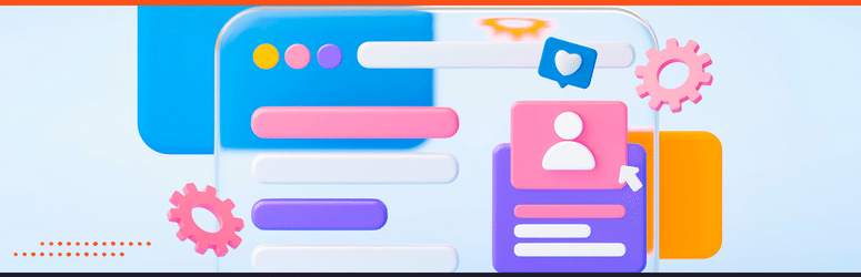
Interactive Elements: Making User Engagement Natural and Enjoyable
Interactive elements are crucial to a user’s engagement with a website. These elements, which include buttons, forms, sliders, and animations, allow users to interact directly with the site, making their experience more engaging and enjoyable.
Buttons
Buttons are perhaps the most common interactive elements. They guide users towards desired actions, whether signing up, downloading a file, or purchasing. The design of a button, including its color, size, shape, and positioning, can significantly influence its visibility and the likelihood of it being clicked.
Forms
Forms, another common interactive element, facilitate direct communication between users and the site. They are typically used for sign-ups, inquiries, or feedback. The design of a form, including the number and nature of fields, the layout, and instructions, can impact the user’s willingness to complete and submit the form.
Sliders and Animations
Sliders and animations can add visual interest to a website, making the user experience more dynamic and engaging. However, they should be used sparingly and strategically, as excessive animation can be distracting or overwhelming.
Interactive elements should be designed to make user engagement natural and enjoyable without causing confusion or frustration. They should be visually distinctive, intuitively placed, and easy to use.
By successfully integrating interactive elements, you can significantly enhance the user experience on your website, encouraging users to spend more time on your site and engage more deeply with your content.
Conclusion
In conclusion, web design is a multifaceted discipline that combines aesthetics with functionality.
Effective design relies on several critical elements – the strategic use of whitespace, thoughtful typography, a cohesive color scheme, and interactive elements.
When skillfully integrated, these aspects create a user-friendly, engaging website that looks good and aligns with your brand’s objectives.
By understanding the significance of these elements, you can leverage them to create a website that resonates with your target audience, encourages interaction, and ultimately drives success for your online presence.