If you've pulled up our website or seen an email from us this week, you noticed something different. New logo, new colors, a fresh coat of paint across the whole site.
Before anything else, here's the part that matters if you're a client: this was a design change and nothing more. Same company, same team, same services, same pricing. I just decided it was time for a new look.
There was no grand plan
Honestly, there was no big strategy meeting behind this. A couple of weekends ago I was at my desk, heads down building something for a client, and I pulled up our own website to reference a page. I sat there looking at it and thought, "I'm kind of tired of this." That was the whole spark.
So I spent that Saturday and Sunday redrawing the logo, picking new colors, and reworking the look of the site. By Monday, FatLab had a new brand.
Goodbye to the old dog (sort of)
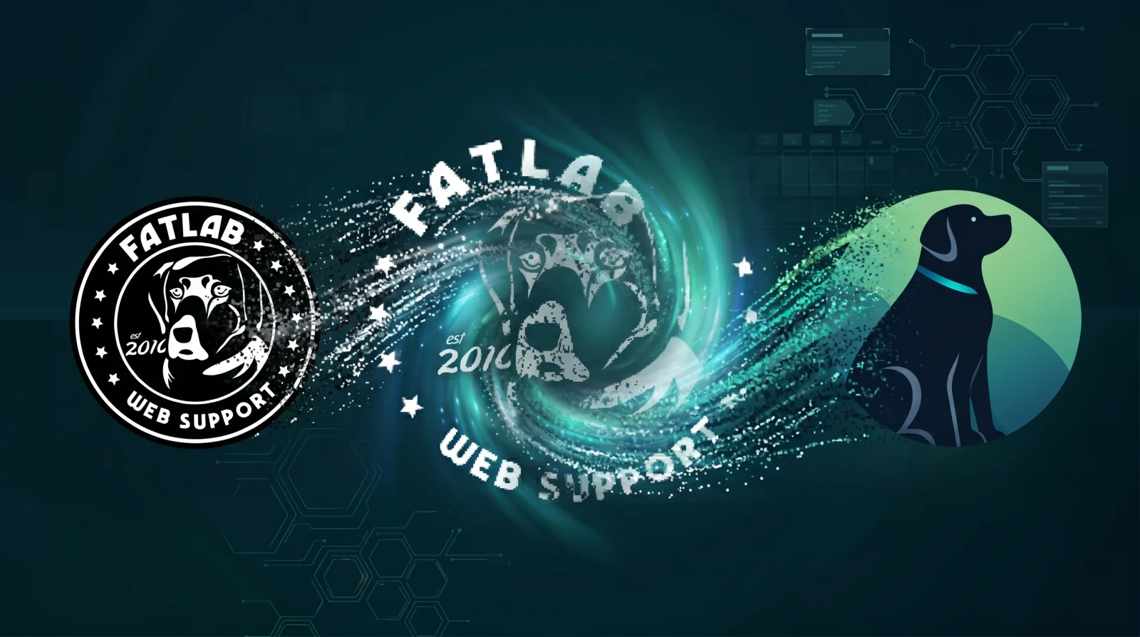
We'd carried the same logo for years: a black, almost brewery-style badge with our Labrador front and center. That dog was Guinness, my black lab and the reason this company is named FatLab in the first place. If you've never read that story, here it is: RIP: The Original "Fat Lab".
I always liked that the badge looked like something you'd find on a coaster or a craft beer label. It had character, and it fit the slightly silly origin of the name. After all that time, though, I wanted something with more color and a little more life to it.
There's also one thing about that old badge I can finally come clean about. It said "est 2010." We were actually incorporated in 2011. The designer just thought 2011 didn't look as good in the layout, so 2010 it was. I let it slide, partly because I'd started kicking the idea around in 2010 anyway, so close enough for a logo built around a pudgy Labrador. It was a tiny thing, but it always bugged me a little that the year was technically wrong. So if nothing else, the new look is my chance to quietly set the record straight: FatLab was founded in 2011.
Good news for the sentimental types like me: the dog stays. The Labrador is still the heart of the brand. He just traded the old stamp for a cleaner, brighter look, with a sage-to-teal palette and a proper collar.
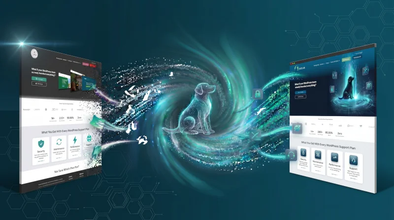
The website got a makeover too
The logo was only half of it. As long as I was in there, I restyled the whole website to match the new brand: the new colors, the updated logo, cleaner type, and a darker, more modern feel that suits the new palette. Same pages, same information, same plans and pricing, just wearing a new coat. If you have us bookmarked, everything is right where you left it.
Why I can pull this off over a weekend
Here's where I get to sound old. I remember when rebranding a company was a genuinely massive undertaking. You didn't change a logo on a whim, because a logo lived on physical things. Boxes of letterhead. Envelopes. Business cards. Signage. Branded folders. Changing the logo meant tossing all of it in the recycling and reprinting from scratch, which cost real money and made you think hard before doing it.
That world is mostly gone, at least for a small shop like ours. We work from home. I can't tell you the last time I handed someone a business card, and we haven't ordered letterhead in years. So when I decided I wanted a new look, there was nothing to throw away. I updated the website, the logo files, and our email signatures, and that was basically it.
Being small and nimble has its perks. So does running a modern business where most of your "stuff" is digital.
What this means for you
If you're a client, the short version is that nothing changes for you. To be specific:
- Same company. FatLab, LLC is the same business it was last week. No change to our corporate structure.
- Same ownership. Still me. No sale, no merger, no new partners.
- Same team. The same people you already work with are still here.
- Same services. Your hosting, maintenance, and support work exactly as they did before.
- Same pricing. Your rates and plans are unchanged.
This was a fresh coat of paint, not a new building.
Here for the long haul
We've been doing this since 2011 (for real this time, no matter what the old logo claimed), which puts us right around 15 years in. We plan to be around for a good while longer, and after a decade and a half I figured we'd earned a clean, modern look to carry us into the next stretch.
Thanks for being part of it. If you want to see the new look in the wild, it's all live over at fatlabwebsupport.com.
Frequently Asked Questions
Did FatLab get acquired or change ownership?
No. FatLab, LLC is the same independently owned company it has always been. The rebrand was purely a visual update to the logo, colors, and website.
Are your services or pricing changing?
No. Hosting, maintenance, support, and every other service stay exactly the same, at the same pricing. You don't need to do anything.
Do I need to update anything on my end?
Nothing is required. If you happen to display a FatLab logo anywhere, such as a "hosted by" badge, we're glad to send you the updated files, but there's no rush and no obligation.
What happened to the original dog logo?
It served us well for years and was a tribute to Guinness, the black lab this company is named after. The Labrador is still the centerpiece of our new logo, just redrawn in a brighter, more modern style.